
COLOR SETTINGS
Let's start with the bad news: everyone has a different perception of color! The way we perceive color depends on numerous variables. Are we looking at a screen, or a print on paper. Are we viewing it in broad daylight, or perhaps under the light of a tablelamp?
Fortunately there's also some good news: color is measurable. And that's exactly what we are good at here at Aeroprint. We conform to the tried and tested ISO 12647-2:2009 standard. On this page you will find some useful information that can help you finetune your software's settings. Our focus is primarily on Adobe Creative Cloud. If you have any questions about the color settings in other software, please don't hesitate to contact us. We are glad to help!
Adobe Bridge
Perhaps it's not the most exciting piece of software in the Adobe Creative Cloud, yet Bridge is essential to your color management workflow. In Bridge you can synchronize the color settings of all the relevant applications in Creative Cloud (ie. Photoshop, Indesign and Illustrator).
Creating the color settings
To start we create a new set of color settings in one of the Creative Cloud applications (Photoshop, Illustrator or Indesign). Below you will find a more extensive tutorial on how you can do this, but if you want to skip this step you can download the settings right here:
- Coated — Aeroprint_ColorSettings_v1.0_PT1-2_Coated.csf.zip
- Uncoated — Aeroprint_ColorSettings_v1.0_PT4-5_Uncoated.csf.zip
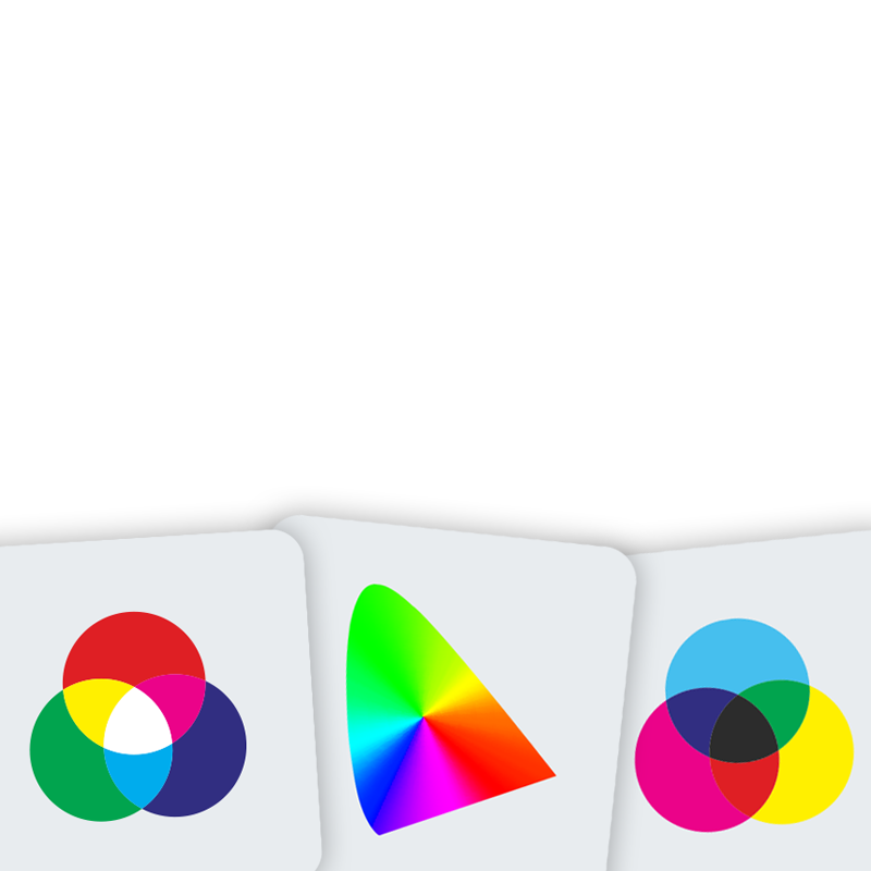
The key take away is the conversion from RGB to CMYK. A lot of information is lost in that process. There are countless colors that are easily reproducible on your screen (RGB) weer te geven zijn, but are mostly lost in print (CMYK). For the best possible conversion we make use of ICC color profiles. In brief these profiles will calculate the nearest reproducible CMYK value for every RGB color.
At Aeroprint we use the following profiles:
For 'Gray' en 'Spotcolor' we use the black channel (K) of the ISO Coated v2 profile.
Under Color Management Policies select 'Preserve Embedded Profiles' for both RGB, CMYK as well as Grayscale. With these settings all embedded profiles in photos and images will be preserverved, thus avoiding unwanted color conversies. TIP: activate all color warnings by ticking off all the options under Profile Mismatches and Missing Profiles. That way you will always get a warning when the color settings in your document are different from the desired settings.